
How to Choose Balloon Colours for Your Event
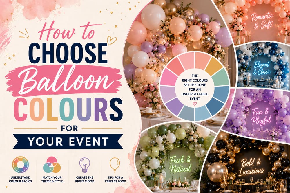
The easiest way to choose balloon colours is to start with two or three shades — one main colour, one accent, and optionally one neutral — pulled from the event’s existing colour cues: an invitation, a brand palette, the venue’s decor, or the guest of honour’s favourite colours. Too many colours in one installation usually reads as busy rather than festive, while a tight, intentional palette photographs better and feels more cohesive in person.
This guide walks through how to match balloon colours to the occasion, the venue, and your photos, plus common combinations by event type and the mistakes worth avoiding. Happy Day Toronto builds custom colour-matched balloon installations for events across Toronto and the GTA, and the same principles below apply whether you’re planning the palette yourself or working with a decorator.


Quick Answer: How to Start Choosing Your Palette
Before picking specific shades, settle on three things: the occasion’s tone, the venue’s existing colours, and whether the decor needs to match a brand or a specific theme. Once those are clear, a simple approach works for most events:
- Choose one main colour that carries the largest share of the installation
- Choose one accent colour that adds contrast or highlights the focal point
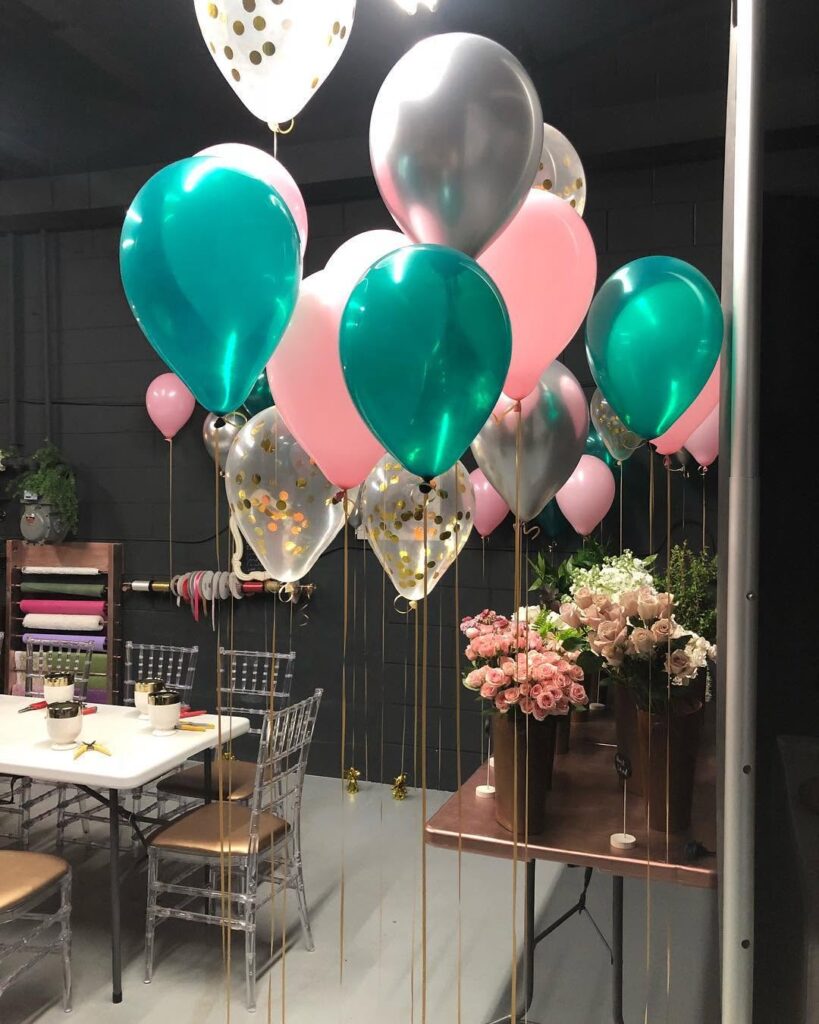
- Optionally add one neutral — white, cream, or a metallic like gold or silver — to soften the combination and make the main colours stand out more
This structure keeps the palette readable at a glance, whether guests are seeing it in person or in a photo.
Match Colours to the Occasion
Different occasions call for different colour intensities and tones, and starting here narrows the choices quickly. Milestone birthdays and kids’ parties tend to support bright, saturated colours that read as fun and energetic. Weddings and engagement parties usually lean toward softer, more muted tones — blush, sage, ivory, dusty blue — that read as elegant rather than playful. Corporate events typically call for a tighter, brand-matched palette rather than a broad seasonal or celebratory one. Baby showers commonly use soft pastels, sometimes tied to a gender reveal or a neutral palette depending on the family’s preference.
Starting from the occasion, rather than a favourite colour alone, usually produces a palette that matches the mood guests expect walking in.
Match Colours to the Venue and Existing Decor
A venue’s existing colours — walls, lighting, flooring, furniture — form the backdrop every balloon colour gets seen against. Choosing a palette that complements this backdrop, rather than fighting it, makes the installation look intentional instead of mismatched. A warm-toned restaurant with wood accents pairs well with warm balloon colours like terracotta, amber, or deep red, while a bright, white, minimal venue can support bolder, more saturated colours without clashing.
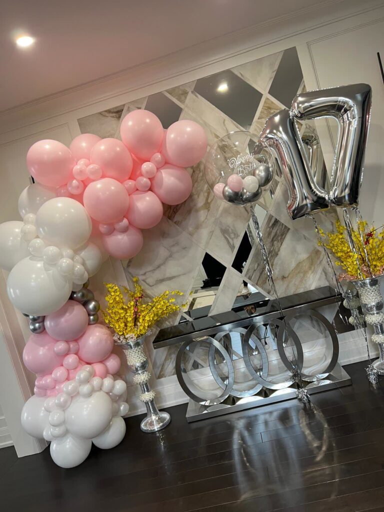
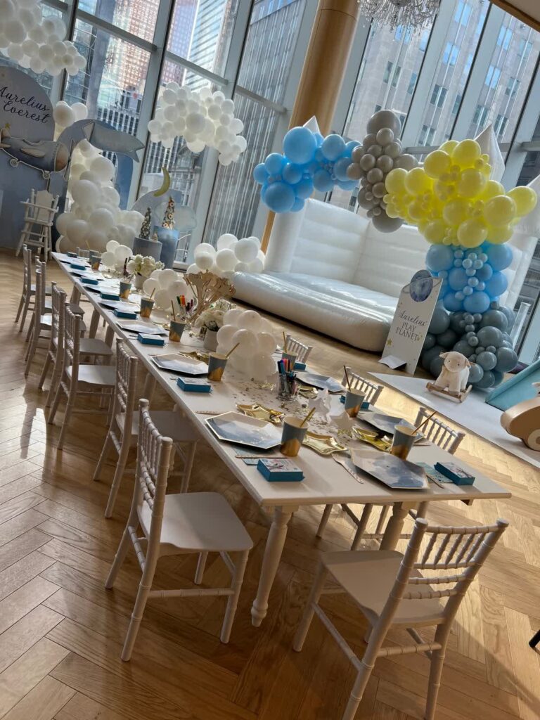
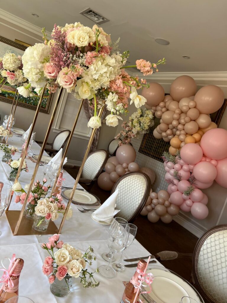

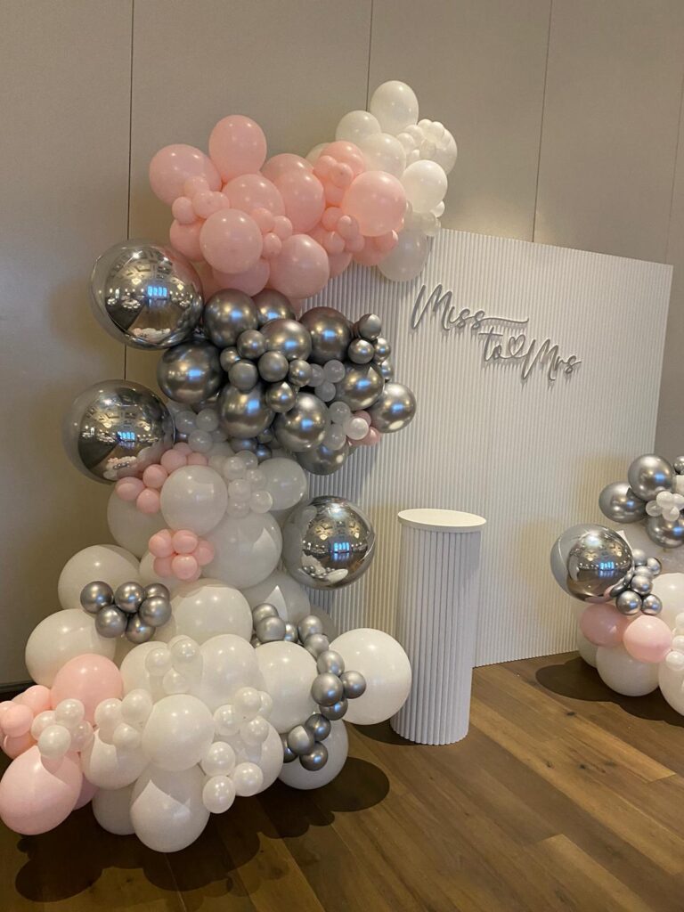
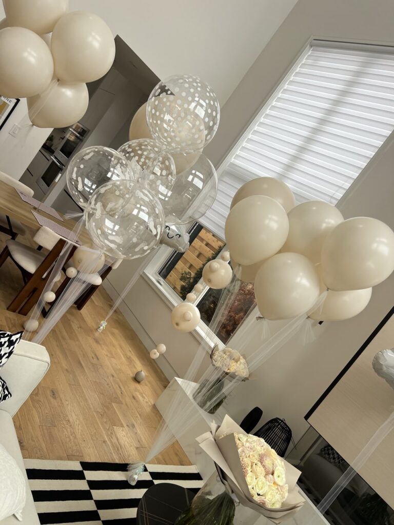

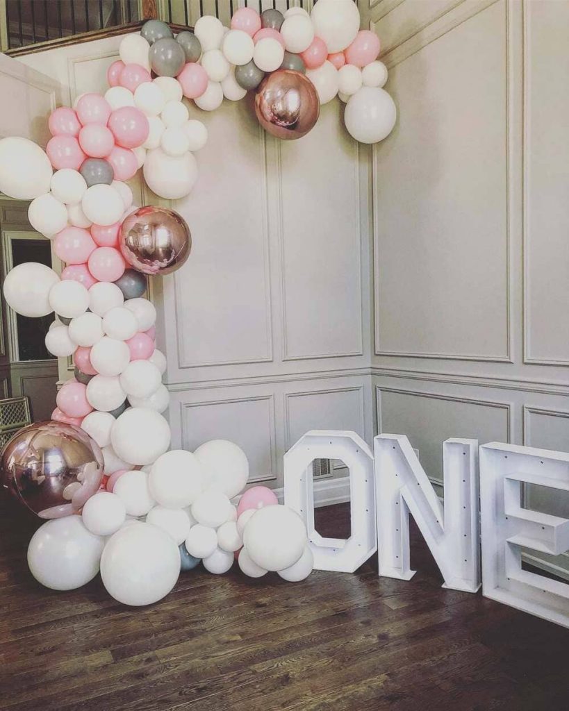
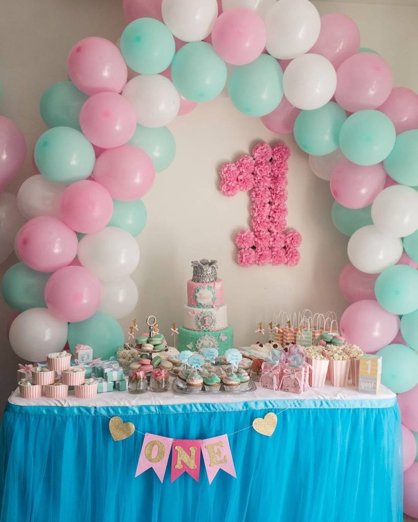
Lighting changes how balloon colours actually read once installed. Warm, yellow-toned lighting shifts cooler colours like blue and purple, while bright white lighting keeps colours closer to how they look in daylight. Sharing photos of the actual venue, including its lighting, with your decorator helps set realistic expectations for how the final palette will look in the room.
Using a Two-or-Three-Colour Rule
Balloon installations with more than three colours tend to lose visual clarity, especially at a distance or in photos, where too many competing shades blend into visual noise rather than a clean design. A simple two-or-three-colour structure — one dominant shade, one accent, and an optional neutral — keeps the design readable and gives it a more polished, considered look.
This doesn’t mean the installation needs to look plain. Varying the balloon sizes, finishes (matte, chrome, pearl), and shapes within the same two or three colours adds visual interest without introducing new colours that compete for attention.
Balloon Colour Psychology
Colour carries an emotional tone, and understanding the general associations helps narrow choices for a specific event mood:
- Red and warm tones read as energetic, bold, and celebratory — common for milestone birthdays and grand openings
- Blue and cool tones read as calm, trustworthy, and clean — common for corporate events and baby showers
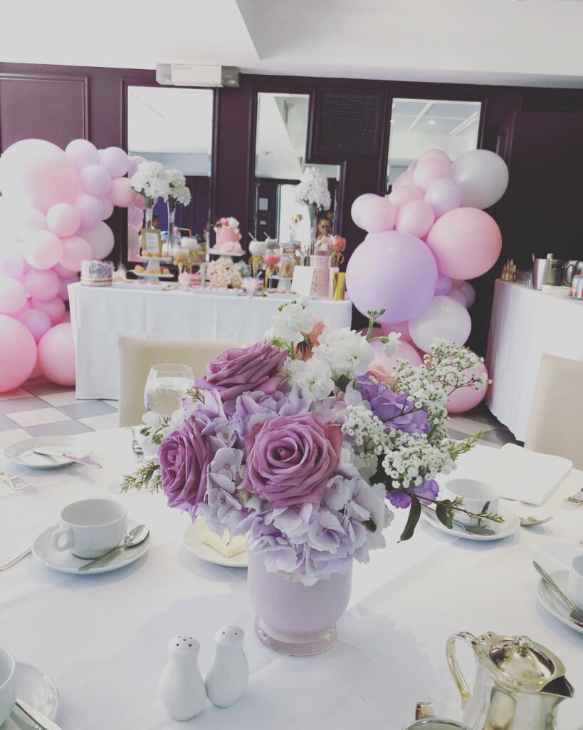
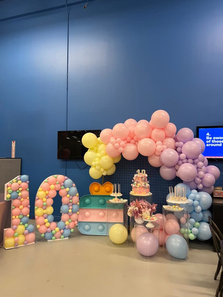
- Pastels (soft pink, baby blue, mint, lavender) read as soft and gentle — common for baby showers and children’s parties
- Gold, silver, and metallics read as elegant and celebratory — common for anniversaries, milestone birthdays, and New Year’s events
- Green tones read as fresh and natural, and pair well with floral accents — common for garden-style or spring events
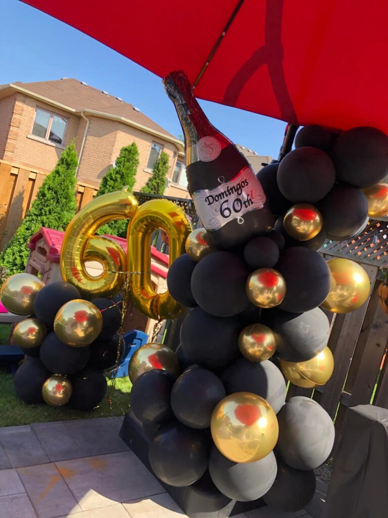
- Black paired with a bright accent reads as bold and modern — common for milestone adult birthdays and sophisticated corporate events
These associations aren’t strict rules, but they’re a useful starting point when the event doesn’t already have a colour locked in by a theme or brand.
Corporate and Brand Colour Matching
Corporate events usually need balloon colours matched precisely to a company’s brand palette, rather than a general seasonal or celebratory combination. Balloon colours come in a wide, consistent range, which makes matching a specific brand shade more achievable than with some other decor materials. Sharing the exact brand colour codes with your decorator, rather than a general description like “blue,” helps get the closest possible match. Our corporate event balloon service builds installations matched to a company’s actual branding for launches, trade shows, and office celebrations across Toronto and the GTA.
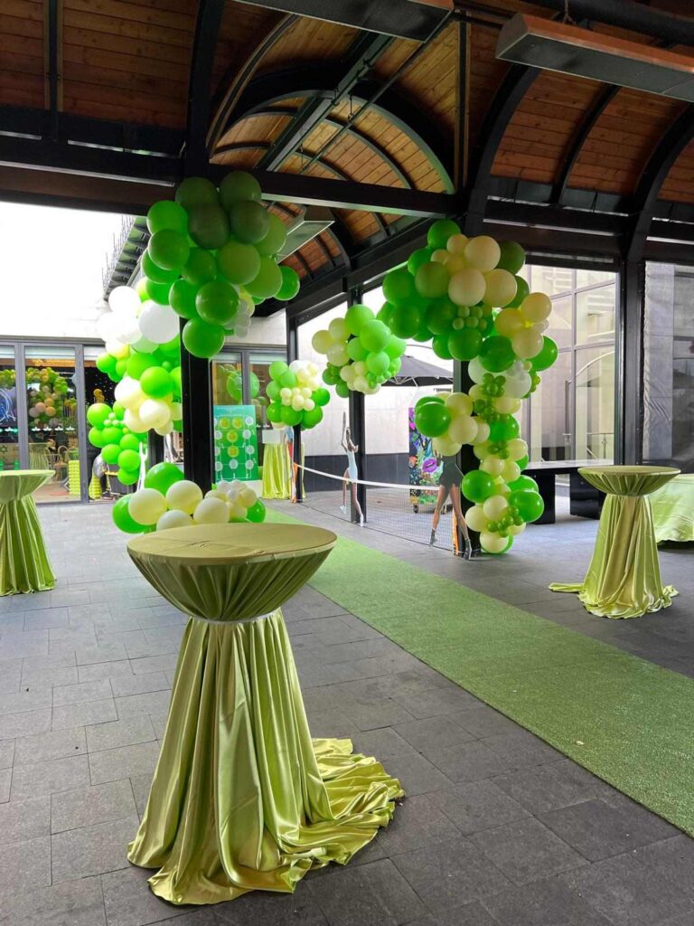
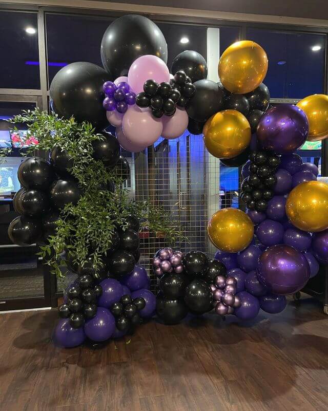
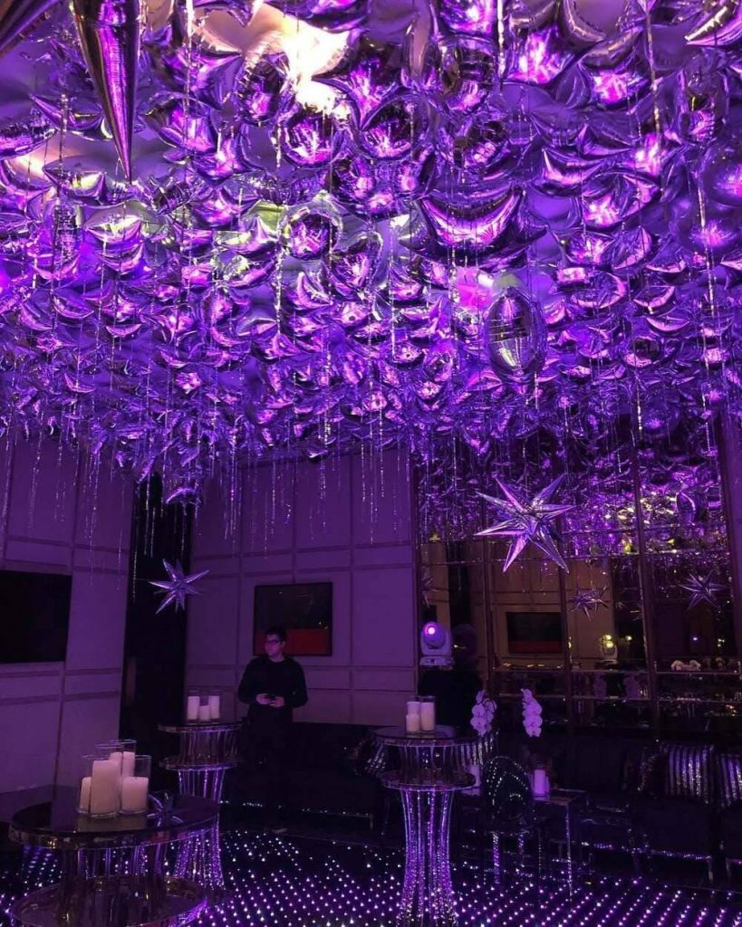
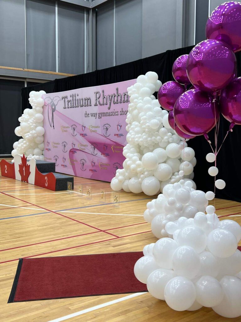
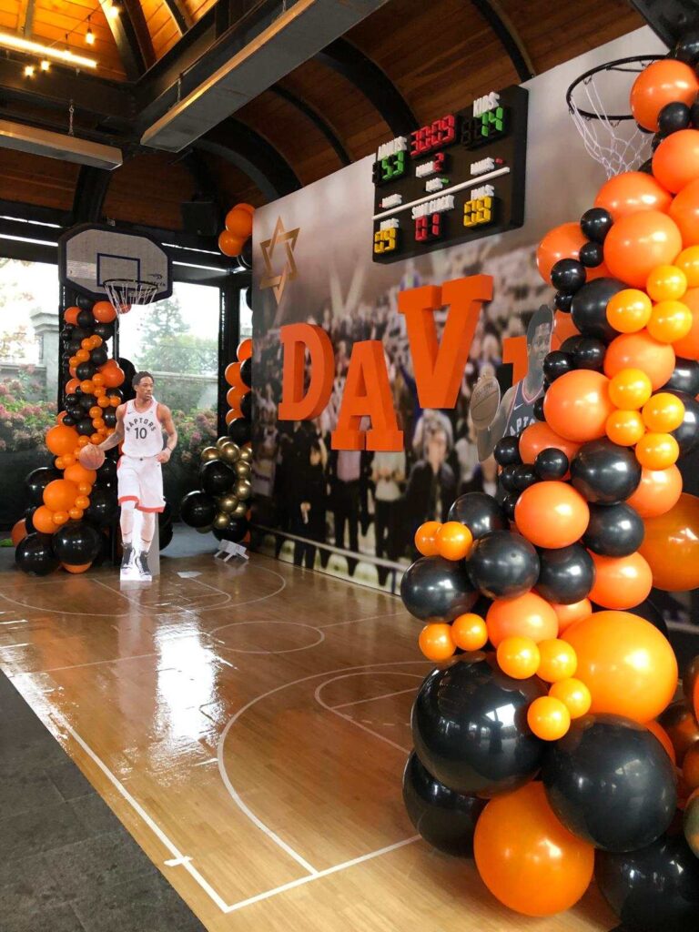

Keep in mind that balloon material reflects light differently than a screen or a printed brand guide, so an exact colour match can’t always be guaranteed. Reviewing physical balloon samples, when possible, gives a more accurate sense of the final colour than a digital swatch alone.
Seasonal Colour Palettes
Time of year offers another natural starting point for choosing a palette, particularly for events without a strict brand or theme requirement. Spring and summer events often lean toward brighter, lighter colours — pastels, fresh greens, warm yellows. Fall events commonly use richer, warmer tones — burgundy, amber, deep orange, mustard. Winter and holiday events often bring in metallics, deep greens and reds, or a cooler, icy palette of white, silver, and pale blue. Matching the palette to the season helps the installation feel connected to the time of year, especially for outdoor events or venues with large windows where natural light and surrounding scenery become part of the overall look.
Popular Colour Combinations by Event Type
| Event Type | Common Palette |
|---|---|
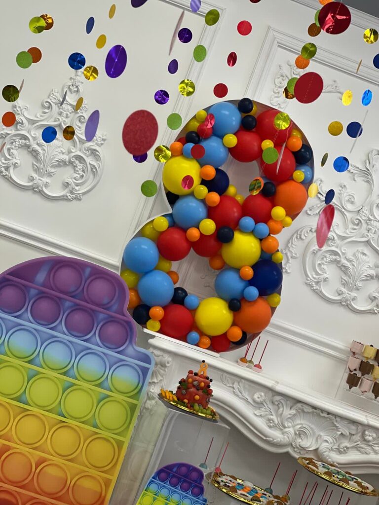
| Kids’ birthday party | Bright primary colours, or a themed palette tied to a favourite character or interest |
| Milestone adult birthday | Black, gold, and one bold accent colour |
| Wedding or engagement | Blush, ivory, sage, or dusty blue with a metallic accent |
| Baby shower | Soft pastels — pink, blue, mint, or a neutral palette like sage and cream |
| Corporate event or launch | Brand colours, typically two shades plus white or a metallic neutral |
| Holiday party | Deep red and green, or a modern metallic palette of gold, silver, and white |
| Graduation | School or program colours, often paired with white or gold |
| Anniversary | Gold, blush, or a colour tied to a specific anniversary milestone |
Matching Colours Across Different Balloon Types
Latex, foil, and bubble balloons don’t always render the same shade identically, even when labelled the same colour name. Latex balloons have a slightly translucent quality that can shift how a colour looks depending on the lighting behind it, while foil balloons have a more solid, reflective finish that reads as more saturated. Bubble balloons, being clear plastic, show whatever colour is placed inside them, which can look slightly different again once encased.
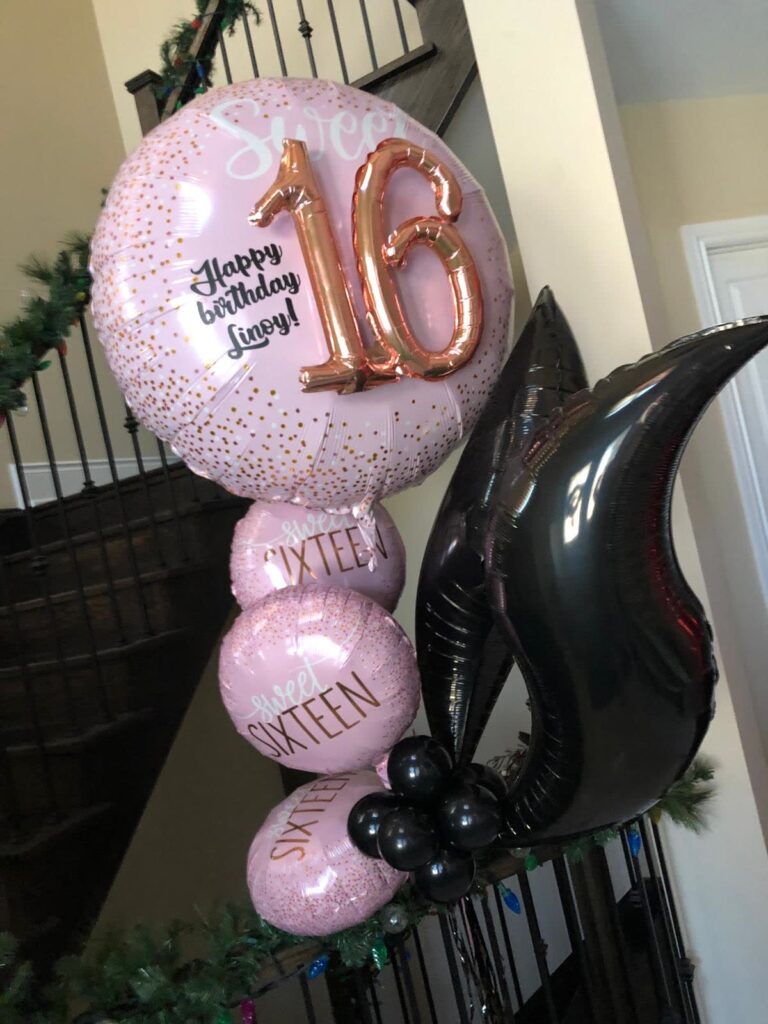
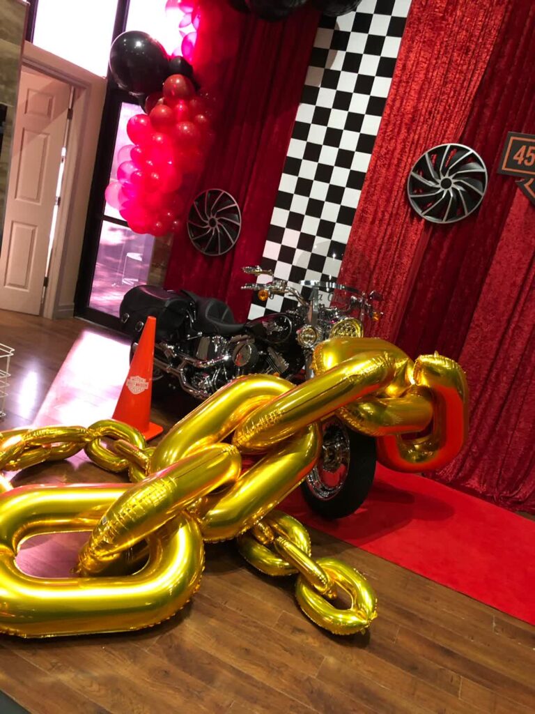
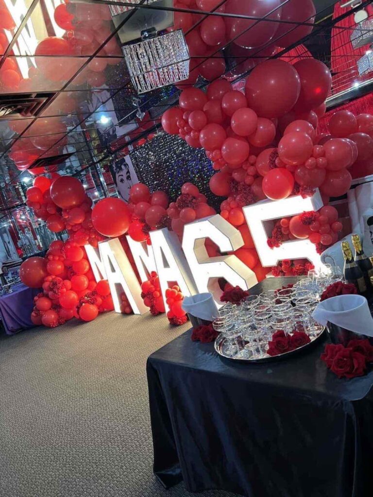

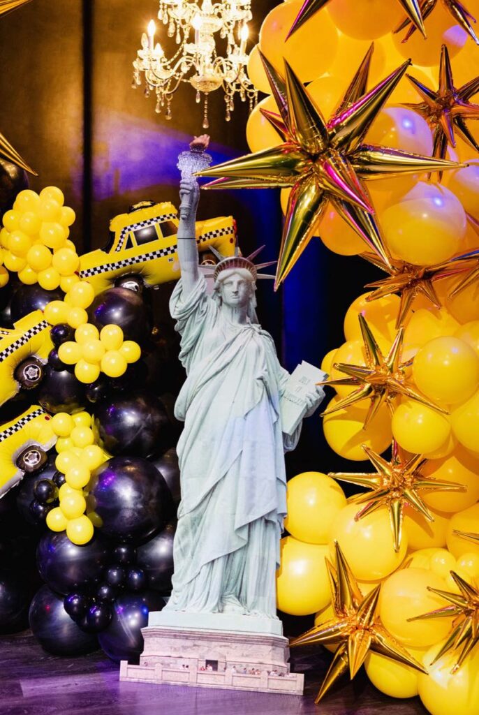
When a design mixes balloon types, testing a small sample together before committing to the full installation helps confirm the colours read as a cohesive set rather than several close-but-not-quite-matching shades.
How Photography Affects Colour Choice
Most events get documented in photos, and some colours photograph differently than they appear in person. Pale pastels can wash out under bright flash photography or strong overhead lighting, losing definition against light-coloured walls or backdrops. Deep, saturated colours generally hold up better in photos, since they maintain contrast against most backgrounds and lighting conditions. If photography is a priority for the event — a milestone celebration, a branded photo wall, a wedding — leaning slightly more saturated than the palette looks in a mood board often produces better results once captured on camera.
Contrast also matters for photos more than it does for the room in person. A palette with too little contrast between the main colour and the background can blend together in a photo even if it looks fine to the eye standing in the room. Adding one higher-contrast accent colour, or a neutral like white, usually fixes this without changing the overall mood of the palette.
Colour Combinations Worth Approaching Carefully
A few combinations tend to cause more difficulty than others, and it helps to know this before finalizing a design:
- Multiple similar mid-tones together (several shades of medium pink, for example) can blend into each other rather than creating contrast, especially from a distance
- Very light pastels without any darker accent can look flat or underwhelming in photos, particularly in a large space or under bright lighting
- More than one metallic finish at once (gold and silver and rose gold together) can compete with each other rather than complementing the palette
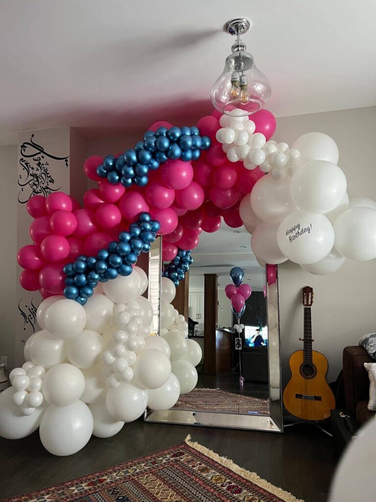
- High-saturation colours paired without a neutral buffer can feel overwhelming in a small space, even if each individual colour would work well on its own
None of these combinations are strictly off-limits, but they generally need more careful balancing — through balloon size variation, spacing, or an added neutral — to avoid the pitfalls above.
Adjusting a Palette for Different Balloon Structures
The same colour palette can need slight adjustments depending on the shape of the installation. An arch or garland, viewed mostly from the front and sides, benefits from colours placed with intentional rhythm — clusters of the main colour interspersed with the accent, rather than a random mix. A backdrop, viewed straight-on and often photographed close-up, can support a denser, more layered mix of the same two or three colours since guests see it more directly. Ceiling installations, viewed from below and often at a distance, generally read best with fewer, bolder colour blocks, since fine colour variation gets lost when guests are looking upward from across a room.
Common Mistakes When Choosing Balloon Colours
- Choosing too many colours at once, which reads as cluttered rather than festive, especially in photos
- Ignoring the venue’s existing colours, which can cause the installation to clash with walls, flooring, or furniture
- Relying only on a screen to judge colour, when balloon material and venue lighting both shift how a colour actually looks in person
- Skipping a neutral or accent colour, which can make a single-colour design feel flat rather than intentional
- Not accounting for lighting changes between daytime setup and evening event lighting, especially for events that start in daylight and run into the evening
Planning Checklist for Choosing Balloon Colours
- Identify the occasion’s general tone — bright and playful, or soft and elegant
- Gather reference points: an invitation, a brand guide, or photos of the venue
- Choose one main colour, one accent, and an optional neutral
- Share photos of the actual venue and its lighting with your decorator
- Confirm brand colour codes for any corporate or branded event
- Test a small sample if mixing latex, foil, and bubble balloons in the same design
- Lean slightly more saturated than a mood board suggests if photography is a priority for the event
FAQ
Getting Started
How many colours should a balloon installation use? Two or three colours generally works best — one main colour, one accent, and an optional neutral. More than three colours tends to look busy rather than intentional, especially in photos.
Where should someone start if they don’t have a colour scheme yet? Start with the occasion’s general tone and any existing reference points, like an invitation, a venue’s decor, or the guest of honour’s favourite colours. These usually narrow the choice down quickly without needing a formal colour theory background, and a decorator can help refine the shortlist further from there.
Matching to Venue and Brand
Do balloon colours need to match the venue’s existing decor? It helps significantly. A palette that complements the venue’s walls, lighting, and furniture looks intentional, while one that ignores the existing colours can clash, even if the balloon colours themselves are attractive on their own.
Can balloon colours match an exact company brand colour? Yes, closely in most cases. Sharing the exact brand colour codes, rather than a general colour name, gives the best chance of a close match, though balloon material and venue lighting mean an exact match can’t always be guaranteed.
Practical Concerns
Do latex, foil, and bubble balloons look the same in the same colour? Not always. Latex has a slightly translucent quality, foil is more solid and reflective, and bubble balloons show whatever colour sits inside them. Testing a small sample together helps confirm they read as a cohesive set rather than several close-but-not-quite-matching shades.
Does lighting change how balloon colours look once installed? Yes, significantly. Warm lighting shifts cooler colours, while bright white lighting keeps colours closer to how they appear in daylight. Sharing photos of the venue’s lighting in advance helps set realistic expectations for the final look.
What’s a safe colour combination for someone who isn’t sure what to choose? A neutral paired with one bold accent colour — such as white and gold, or ivory and burgundy — works well across most occasions and rarely clashes with a venue’s existing decor.
Does the palette need to change depending on whether it’s an arch, a backdrop, or a ceiling installation? Slightly, yes. Backdrops can support a denser mix of colours since guests view them close-up, while ceiling installations read better with fewer, bolder colour blocks, since fine detail gets lost when viewed from below at a distance.
Happy Day Toronto builds custom, colour-matched balloon installations for birthdays, weddings, corporate events, and celebrations across Toronto and the GTA. Request a quote or explore our balloon arch and garland and balloon and flower decoration services.
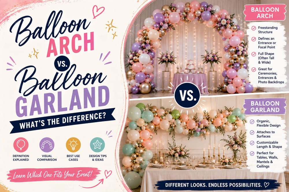
Balloon Arch vs. Balloon Garland: What’s the Difference?
A balloon arch is a curved, freestanding structure built on a frame. A balloon garland is a flexible strand of balloons that…